In DIT & Partners, we have very clear ideas: an essential and innovative approach is also fundamental in our profession. Excellence is demonstrated by competence, not by words. We leave nothing to chance, and we make sure that our brand immediately communicates this philosophy of ours.
This is how the graphic and architectural work around DIT & Partners was born. Exact proportions and dynamic geometries define every detail, from the logo to the office.
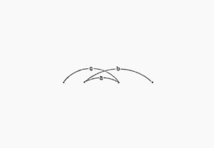
Who better defined the modern concept of proportions? It was immediately natural for us to be inspired by Le Corbusier and his Modulus.
 The identity involves different aspects of the brand, linking the architectural design of the offices with the digital presence of the studio.
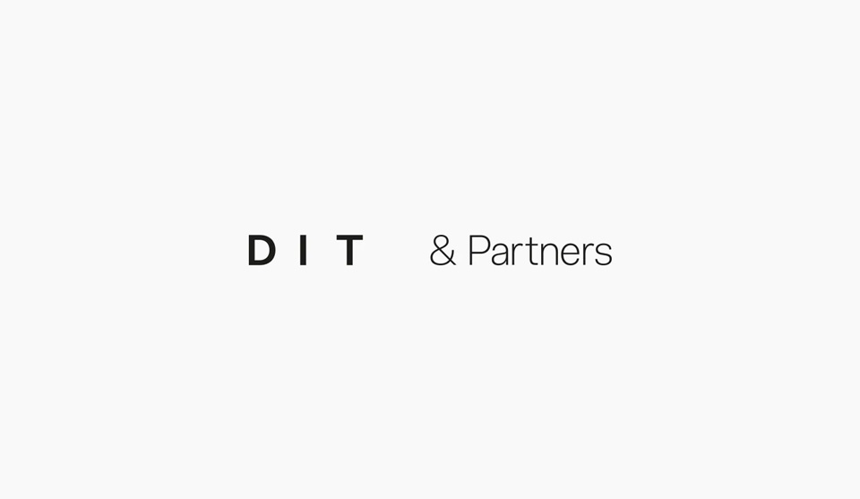
The result is a very minimal logo, which through the empty spaces communicates the harmony of proportions, without frills or excesses.
However, the harmony and precision had remained too static, which is why we added the dynamism of the lines, which redefine the distances and connections between the graphic elements. The animated visuals of this website were designed with this in mind.
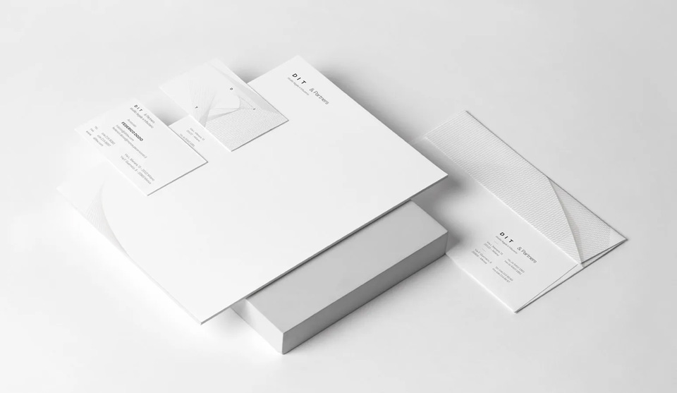
From the digital to the physical, we have left nothing to chance (a fundamental quality in our profession). The digital identity has been declined also on business cards, headed paper and envelopes with great attention to the textures of the material of each object.
The attention and care that we have brought to the definition of our image are our distinctive trait, which we do not fail to apply in any case that we deal with.
Architectural design: Studio Becatti Barrera
Graphic design: Studio Up Web Agency Milano